
 The Bicycle as a symbol of progress, of renewal, of promising times ahead. This is not a new concept. Indeed it has been around since the invention of the bicycle. Many bicycle posters at end of the 19th century featured promising themes like liberation, progress, freedom. Here’s an example:
 In this beautiful poster, there is a lot of metaphorical gameplay. The young woman is riding a bicycle to the future. Dressed in white and seemingly casting fresh flowers as though leaving a trail for us to follow. The old woman is looking backwards to the past as she sits in a bed of thorns, almost resigned to the fact that the future - the bicycle - is passing her by. When people in most cultures see art or photgraphy, our brain sees movement from left to right and interprets the piece based on that.
The German historian and psychologist Rudolf Arnheim who wrote, among other books, "Art and visual perception – A psychology of the creative eye" noticed that the way many cultures read - from left to right - has an influence on the way we look at art or photography.
‘Since a picture is “read” from left to right, pictorial movement toward the right is perceived as being easier, requiring less effort’.
Bicycles often look better when heading off to the right. In the photo shoots we've done for bicycle brands, we are always careful to shoot the right side of the bicycle wherever possible, so that the chainguard is visible. It just looks better with the chainguard in the shot, but it also looks better heading to the right.


The flag at the top is the party flag for the Samajwadi political party in India. In 2012, their rising star, Akhilesh Yadav, won a landslide election in the Uttar Pradesh state elections. Yadav campaigned tirelessly and he rode hundreds of kilometres around the state on his bicycle and organised bicycle rides. Reuters has an article about his rise to power. He thrashed the heir-apparent in Indian politics, Rahul Ghandi by appealing to the working classes, sleeping in villagers huts and aligning himself with the demands of the regular citizens. And the man can even text and cycle at the same time. He's got our vote.
So a bicycle is a fitting symbol for the party. For any progressive party who aspire to be agents of change. I have no idea if the designer thought about the positioning of the bicycle on the flag at the top. Based on this Left to Right perception, the bicycle isn't heading away from us, carrying us to a better future and all the other metaphors you can think of.. The positioning of it - in our perception - suggests that it is going in the opposite direction. Going against the flow, or against the grain, as it were. Which can be symbolic in a positive sense for a political party wishing to embrace change and deconstruct the status quo, but that's far too subliminal. Interestingly, on the political party's Facebook group and elsewhere, there are versions of the flag reversed so it points left to right.This started out as an article about Mr Yadav and his party's use of the bicycle as a symbol. A discussion started here at Copenhagenize Design Company, however, about how bicycles are positioned in signage and pictograms.
If we suppose that a bicycle heading from left to right is 'positive' symbolism for our sub-conscious perception, then surely bicycle pictograms and signage should feature this directional placement. We all went over the window to look at the Danish standard on the cycle tracks outside and looked at other examples from around us in Copenhagen.
(Clockwise from top left) The Danish standard as dictacted by the Road Directorate is a bicycle heading from right to left, although the logo of the City of Copenhagen's Bicycle Office - "I Bike CPH" - features a bicycle in the 'positive' direction. The logo for The Green Wave in Copenhagen has the bicycle user in "metaphorical direction neutrality" - could be heading towards us or away from us. I've always percieved this as the bicycle heading towards me, come to think of it. While the standard for Danish signage is right to left, there are variations. Wayfinding for indicating routes on the national cycling network. On the bicycle seat belts on the train to Malmö, the bike heads right. At bottom right is a vintage sign I cycle past each day, complete with chainguard, fenders and light. Nice. The Danish State Railways tend to use the standard symbol but they are happy to have the bicycle pointing to the right on variations of their signage.

Above are all the traffic signs in Denmark relating to cycling. At bottom left is the signage for bi-directional cycle tracks, which you don't see often for obvious design reasons. But it's there like a retro memory, like the man at bottom right sitting upright with a splendid hat - old Danish signage that we miss so very much. All in all, the pictograms are standardised to feature bicycles heading left. The traffic engineer logic is that pointing a bicycle to the left indicates potential collision and serves, in their minds at least, to add a safety element to the road signage. Generally, there is a tendency to have the bicycle heading to the right if the signage indicates access or bicycle-friendly facilities, but this is not carved in stone, apparently.

"Bicycle Street - Cars are guests"
We chose, however, to aim the bicycle left to right in our proposal for signage for Bicycle Streets in Denmark. And, even more importantly, we were tired of all the boy bikes in all the pictograms we see around the world, so we made it a proper sit up and beg design with a ladies frame. We like the idea of the Dutch version of their Fietsstraat signs, featuring a cyclist heading towards you, in front of a car. The design, however, is clumsy and it looks hand-drawn. We developed the above proposal based on existing Danish signage. Interestingly, the Dutch signage isn't even official signage, but the Dutch put them up anyway and now people think they are. That's cool.
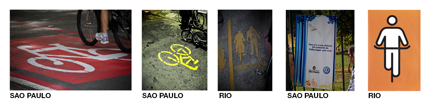
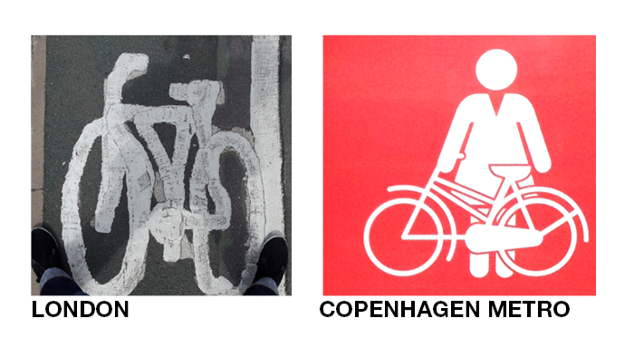
Farther afield, let's have a look through the Copenhagenize archives to see what's up in the bicycle pictogram world..png)
.png)

.png)
.png)
.png)


If, as we mentioned above, ‘since a picture is “read” from left to right, pictorial movement toward the right is perceived as being easier, requiring less effort’, THAT should be the general message on all bicycle pictograms. Send the bicycle from left to right - not only so we can see the damned chainguard - but to broadcast the symbolism of a progressive future.