
 There are a great many reasons why people choose to live in cities. The life, the culture, the job opportunities, the sense of community that you can find even in the presence of great numbers of strangers. When we travel from our home city to another, we will always have our individual observations, often details that nobody else will notice. All based on our own urban experience, our personal preferences and our lives in our home city. You will notice tiny details that will escape me if we were travelling together and vice versa. I have lived in Copenhagen for 20 years or so. I know the city well. There are tiny details that I know and love - or hate - but that other long-term residents of the city will never notice. And, again, vice versa. It is often these details that define the inherent beauty of the urban landscape and make it personalised for every user, resident, citizen.
For the past two years I have been renting out a room in my flat through airbnb.com. It has been a wonderful experience hosting people in the city that I love and I call home. The thing that I have noticed that relates to this article is the details that these individuals pick up on. A colleague and acquaintance of mine was visiting from Antwerp with his family. They had a great many experiences that we talked about but there were two things that they really had to get off their chests.
One of them was that I desperately needed to invest in new plates. The ones I have they found to be incredibly irritating because they are so noisy when you're using your knife and fork on them. I hadn't noticed that before. The other thing was relayed to me in an incredulous tone. ”Where are the flowers?”, they asked. In Antwerp, they have a charming tradition and culture of flowers hanging outside the buildings from the windows in a great many colours. We simply don't have the same tradition here in Copenhagen and that fact amazed them. How can you not have flowers outside every window on every building?
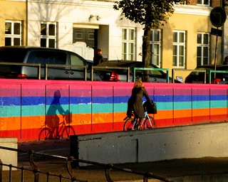
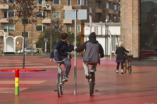
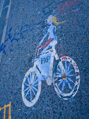
A lot of visitors to Copenhagen, I have noticed, comment on the many colours of bicycles. It would seem that many of the colours, especially the white bicycles, are unusual in many other countries, whereas they are standard fare here.
You can certainly understand why, in the heart of a 15th or 16th century city, colour was a necessity, what with the generally drab tones of the clothing of the citizens as well as all the other sensory challenges an overpopulated city centre bombarded you with. Just read the book Perfume, for example, to get an idea of what Paris might have been like.
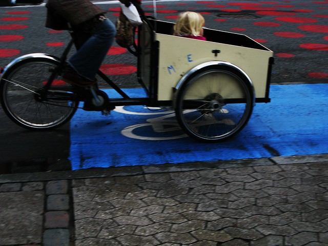
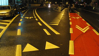
Before these thoughts occurred to me, I remember back in 2008, when one of the more interesting urban experiments in recent Copenhagen history was launched, being amazed at the almost playful red dots and blue and green stripes along Nørrebrogade Street. It was a pilot project, which allowed for much greater freedom in experimenting with the urban landscape. The big red dots signified bus zones. The green and blue stripes signified so-called Flex zones outside shops. Loading zones were set up on side streets and wonderful typography was employed to mark the spot. I just remember thinking that it was so damn cool. I had never seen anything like it anywhere in the world. The asphalt of our cities is one of the greatest unpainted canvases in human history. Blank spaces that are begging to be personalised. I have seen examples on quiet neighbourhood streets in various cities around the world of citizens adding art and colour to the street space but if you think about how much opportunity there is for brightening our cities, it makes you want to invest in the stock of a major paint producer. So let's look at some of the examples that I've seen around the world. Believe me, I haven't seen them all so feel free to add your own examples in the comments with links to images. I'm mostly looking for examples from cities, as opposed to residential streets.
Staying in Copenhagen for a bit, people come from far and wide to see the bold, red design of Superkilen square, designed by starchitect Bjarke Ingels. It may be a cool idea but I am thinking that the bold use of so much paint on this blank urban canvas is an integral part of the draw and fascination.
A few years ago, the city of Copenhagen's Bicycle Office wanted to the put down stickers on the cycle tracks. Heavy duty stickers that are applied with strong adhesives and put into place with heat in order to stay firm. They had many ideas for applications for the stickers, including using the bicycle office's logo and various encouraging texts like the ones on the bicycle railings that we have written about before and that Copenhagenize Design Company developed for the city. The Danish Road Directorate, however, would have none of it. The idea didn't fit into their very square and small box regarding usage of the pavement.
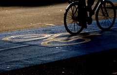
 A compromise was reached, so now and then we do see safety warnings using the stickers. Only on the cycle tracks however not the roads. The one, above, warns about blind spots on turning trucks.
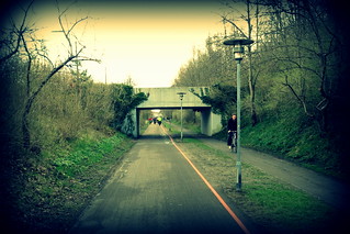
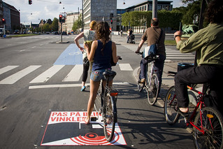
Another recent example from Copenhagen about the immovable attitude of the traffic engineers is an idea for the Copenhagen Bicycle Superhighway network. There was an incredibly simple wayfinding concept to let the users of the network know when they were actually on a stretch of bicycle superhighway. A continuous orange stripe along the entire route, no wider than the dividing line in car lanes. A stripe along the curb and across intersections that would be wonderfully simple to follow and inexpensive to implement. The traffic engineers at the Danish Road Directorate, however, suffered a mass outbreak of nervous tics when the idea was proposed. Unacceptable. Impossible. Simply can't be done. A lot of lobbying work took place but they refused to back down and accept the fact that new ideas need to grow. Even just getting the road directorate to add the new logo for the bicycle superhighway to the official signage along the routes was a major battle. A compromise was reached and the signage was allowed to be changed but the orange stripe idea had to die.
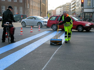
As I understand it, Copenhagen Blue was the preferred choice for the colour of bicycle infrastructure in some cities in America. Then they realised that blue had been allocated to handicap markings and signage and that's why America has gone green. In France, green is also the preferred colour for marking bicycle infrastructure. In the Netherlands many cycle tracks are paved with an earthy, reddish tint which is clearly different than the roadway.
 In Bordeaux, on stretches of tramway heading out of town, they simply plant grass between the tracks.
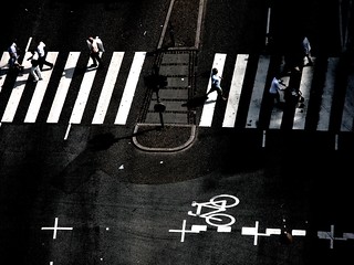
I'm sure somebody will tell me in the comments that white isn't technically a colour but white, at the moment, is all we have to brighten up the fifty shades of grey in the form of pedestrian crossings and other street markings. I like pedestrian crossings so much I published a photo book about them. I have seen some artistic interpretations of pedestrian crossings and every time I see them I just think yes, yes, yes. More of that please.
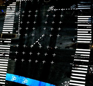
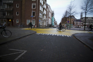
.png) Even just extending the stripes of the pedestrian crossing to follow the actual desire lines of the pedestrians would be a massive improvement, as we suggested in our Choreography of an Urban Intersection study from last year.
Even just extending the stripes of the pedestrian crossing to follow the actual desire lines of the pedestrians would be a massive improvement, as we suggested in our Choreography of an Urban Intersection study from last year.
All of this dull and dreary grey in our cities makes traffic engineering sound like Henry Ford. ”You can have any colour of asphalt you want, as long as it's grey”. Times are changing though. Urban dwellers are demanding new and exciting additions to our cities. We are thinking out of the box like we have never done before. It is an exciting age.
Nevertheless, there is room for improvement and for innovation. I'm certainly not suggesting that every square centimetre of roadway has to be artistically rendered in every colour available to us. I'm just saying that the rigid, last-century mentality about the sacred nature of the urban Wailing Wall - the city streets - has to be changed in order to accommodate all of these new schools of thought about how our cities can be made better, more modern and more human.