
 Hey. You know what? We’re on to a good thing. We have an amazing product. We have the most effective tool in our urban toolbox for rebuilding our liveable cities. It’s right there in front of us. The humble bicycle is back. After transforming society more quickly and more effectively than any other invention in human history for decades in the late 1800s and early 1900s, the bicycle is ready to do it all over again. Nevertheless, many cities are struggling to get people to consider the bicycle as transport. As we have known for over a century, infrastructure is the key. Most certainly, too many cities are hopelessly behind in modernising themselves by creating safe cycling infrastructure. This article is about the other issue at hand, namely how to communicate cycling. Not sporty, sweaty, gear-based cycling for sport or recreation but just good old-fashioned urban cycling for the 99%. This product we work with is produced by hundreds of manufacturers - most of them hopelessly unable to see the bigger picture of promoting cycling, instead focusing on their individual products. Then we have public bodies - be it transport or health, for example - who want to see a massive rise in the number of bicycles used for transport in cities for all the obvious, beneficial reasons to society. Likewise, they have proven ineffective at broadcasting the message in any effective way.
I have called environmentalism the greatest marketing flop in the history of homo sapiens. Just look at the past 40 odd years of focus on awareness and yet there are few people on the planet who are living the environmentalist dream. I lament that fact. It's not hard, however, to see why it happened and continues to happen. There are few humans who react positively to sanctimonious finger wagging from sub-cultural groups that look down their nose at anyone who doesn't adhere to their holy quest. Canadian writer Chris Turner describes it brilliantly in his book The Geography of Hope.
Unfortunately, so much bicycle advocacy seems to be inspired by the same messaging techniques. That whole goofy focus on "green", saving the planet, reducing emissions, blah blah blah. If this line of guilt tripping hasn't worked for the past 40+ years, it's hardly going to kick in now, is it? Look at the marketing that people are subjected to 24/7 on all media platforms. Shiny, positive, professional. The bike geeks should stay the hell away from any form of advertising. Their sub-cultural approach is a failed one. The bicycle was one of the most successful products on the planet for DECADES - in every culture. It sold itself by just being an amazing product but you can not underestimate the massive value of the advertising that was used to sell bicycles and related products to the 99%.Many of you will have seen examples of beautiful bicycle posters from back in the day. I've spent over four years studying them, analysing them and just enjoying them. I give keynotes about the subject. For some reason, I've never written it down in an article. So here we go.
Let's look at a long line of bicycle - and accessory - posters from the annals of history to see what worked so brilliantly back then and what we can learn about broadcasting the same message today. Time is of the essence. Urbanisation is rising rapidly. We need solutions. Wonderfully... ironically... this 19th century invention can solve 21st urban problems. If we sell it correctly and effectively. First, let's look at sewing machines and vacuum cleaners.

- Liberating - it will change your life. Liberate you from whatever constrains you.
- Modern - it's new and exciting and all the kids are doing it. Keep up with the Joneses.
- Elegant - You don't require anything else but the product. It's elegant and so are you.
- Effortless - it's so easy. Seriously.
- Social - It is sociable. Using the product will improve your sociability. More time with friends and loved ones.
- Convenient - It will improve your life with its ease-of-use by freeing up time for other activities. All incredibly effective keywords for marketing any product.

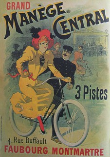
1. Artist: Unknown. Year: c. 1878 / 2. No info / 3. No info
1869
This was an interesting year in history in many ways. Two inventions appeared that would end up in one of the most productive advertising collaborations in history, featuring a veritable army of artists and clients. The first was colour lithography. A massive bucket of rainbow-coloured paint was splashed all over the world of both art and advertising. Before lithography, printing was primarily done by the relief process. Laboriously etching lines onto plates and inking them after which you slapped paper onto them in the hope that the carved motif would be transferred to the paper. Lithography was a chemical process that did away with... well... just about everything difficult about printing.Lithography had been around since 1798 in a similar, but more complicated form developed by Aloys Senefelder. Colour lithography saw the light of day when Thomas Schotter Boys produced some architectural printwork in 1839, but nothing much happened after that until Jules Chéret started a printing company in Paris, in 1866. He wowed everyone with his colourful productions, using new techniques that allowed for an amazing array of shades. Some point to his poster for Bal Valentino from 1869 as the birth of the modern poster.
Chéret focused on the illustration. The artwork. He relegated text to mere supplementary information. He launched upon the world a brave new medium. Artists scrambled to be a part of it. Everyone wanted a piece of the creative action. In 1869, something came along that would set the world alight. Two Englishmen, Reynolds & Mays, patented the Phantom prototype that replaced wooden spokes with thin, metal ones. Three years later, Smith & Starley produced the Ariel bicycle. It was not yet the classic diamond frame that Starley developed in 1885, with the production of the Safety Bicycle, but this "Ordinary" or "Penny Farthing" model sent shockwaves reverberating around the world. Welcome to the birth of a revolution. What an extraordinary machine the bicycle was to the general population of the planet. In a flash, one's mobility radius was greatly expanded. Speeds previously unattainable by humans under their own steam were achieved.Selling Cycling
Bicycles started out in a similar way to sewing machines and vacuum cleaners. The early versions were large, cumbersome and only appealed to a narrow demographic. Early sewing machines and vaccums were complicated machinery operated by men.Early bicycles like the Ariel and all those variations that followed became popular very quickly, absolutely. A kind of pre-boom boom. They were, however, the exclusive domain of rich boys. Bicycles were very expensive to manufacture in, for example, 1880. They cost between $300-$500. In 2014 dollars, that translates to $7,700 - $11,600 (according to the inflation calculator... I love the internet)
The market was small and, as a result, few posters for bicycles were produced between 1872-1890. Also due in no small part to French bicycle production stalling during the collapse of the Second Empire and the defeat in the Franco-Prussian war between 1871-1880. Most marketing was done through elaborately designed catalogues that appealed to the wealthly, well-read customers, as well as advertisments in selected publications read by said customers. It was pointless to advertise to the masses since they didn't have a chance in hell of acquiring the products. The artwork at the top of this section show that lithography was eagerly used but it was restricted to a tiny portion of the population.
1. Artist: Henri Thiriet. Year: c. 1895 / 2. Artist: PAL (Pseudonym for Jean de Paléologue. 1855-?) Year: c. 1900 / 3. Artist: Jules Chéret (1836-1933) Year: 1891 / 4. Magazine cover. Artist: Unknown. Year: 1896 /
I can't possibly hope to show every amazing, historical bicycle poster. There are thousands and thousands of them. Many have also been lost forever (who saves billboards when they're taken down nowadays?). I've done my best to present some of the best of them in various, relevant themes, in order to hammer out a game plan that will apply to today.
Artists flocked to colour lithography. With the invention of the Safety Bicycle - the frame we still know today - the bicycle exploded onto society at large around the world. It was the hottest mainstream product on any market. The hottest media was colour lithography. It would prove to be a fruitful affair if those two hooked up, which they luckily did.
The bicycle captured the imagination of anyone exposed to it. It was the future, progress, modernity. It was everything. The artists who started cranking out posters for the growing army of bicycle brands merely reflected their amazement at the product. The freedom provided by the bicycle was a major factor in advertising for decades to come. This is where it started.
Let's remember the keywords at the beginning of the article and have a look at liberation.
The posters at the top of this section do not mess around. Look at the imagery and the message they are sending. Powerful images of liberation featuring strong characters. The third poster from the left is also the work of Jules Chéret. Like many of the leading artists of the age, he got into the bicycle game and with flair. It's a poster for a French bicycle brand whose name translates as French Banner. Patriotism was also a heady theme at the time.
Chéret was also called the "father of the women's liberation" during his lifetime because of his works - and not just bicycle posters. (When you live in Scandinavia - in a region with excellent levels of gender equality - you don't bat an eyelash at the idea of women's lib having a father). Much has been written about the bicycle's role in women's liberation (although never enough has been written) and there are many inspiring quotes about it.
What Chéret did was portray women in a new, refreshing and - for some (men) - radical way. What contemporary society in Paris saw upon viewing the posters was women who were happy, care-free, stylish and lively. It heralded an age in Paris where women could openly participate in activities like wearing low-cut dresses and smoking. The female caricatures even became known as Cherettes. It all went hand in hand with the liberating effect that bicycles were having on all aspects of society. 1. Artist: Unknown. Year: c. 1900 / 2. Cover of New York magazine "Truth". Artist: Unknown. Year: 22 August 1896 / 3. No info / 4. No info All the metaphors and symbolism of the age were put to full use in the arsenal of the artists. Training as an artist required learning the classics, including historical and cultural symbolism. This transferred subliminally and naturally over to the genre of bicycle posters. Not least because this was a visual language familiar to potential customers. The bicycle was often lifted aloft in reverence to and respect for it's power and transformational effect on society. The second artwork from the left, above, is not actually a poster but the cover of a magazine out of New York called Truth from 22 August 1896. The bicycle triumphant, lighting the way to a bright, new future. No text about content in this issue. Just the woman on her bicycle. There was no limit to the possibilities of the bicycle and everyone knew it. Citizens in cities could travel quicker than ever across the urban landscape. In the countryside, people could extend their transport reach into a previously unheard of radius. We know now that the bicycle improved the gene pool. Nothing less. In the public records in towns, for example, in the UK surnames that had been pegged to towns or districts for centuries were suddenly appearing much farther afield. People started moving around like never before for work and for love. It wouldn't be a stretch to suggest that people were having more sex after the invention of the bicycle. Or at least sex with new people. The inherent thrill about this welcome development may certainly be drawn between the lines in these posters.

1. Artist: Frederick Winthorp Ramsdell. Year: 1899 / 2. Artist: Henri Thiriet. Year: 1898 / 3. Artist: J. Cardona. Year: 1901 / 4. Artist: E. Célos. Year: 1901 / Another theme I've noticed is fantastic hair, symbolizing youth and a care-free attitude. There are countless posters featuring flowers or various, symbolic branches. I have always loved the overwhelming metaphorical gameplay in the second poster for Griffiths. So simple and yet so completely in your face. Young woman in white cycling with free-flowing hair from left to right (to the future) and casually tossing flowers as she goes. Roadside sits an old woman in a bed of flowerless thorns, staring right to left (towards the past). She isn't even looking at the cycling girl, as though resigned to the future passing her by.
At far right is a Canadian brand looking to make inroads into the French market. National markets were huge and incredibly competitive. The rise of the bicycle poster, however, heralded a truly international age. A poster could easily be created by a Romanian artist trained in England (like Jean de Paleologu who has two posters in this article) for a French printer selling Canadian bicycles for a local agent. As ever, art knew no borders.

1. Artist: Unknown. Year: c. 1900 / 2. Artist: PAL (Pseudonym for Jean de Paléologue. 1855-?) Year: c. 1895 / 3. Artist: Jean Carlu. Year: 1922 / 4. Artist: Unknown. Year: c. 1892 / 5. No info. The most iconic posters of the day that are remembered most clearly even over a century later feature female protagonists. Many of the posters were famous in their own time, as well. In a modern optic it may appear that women were being gratuitously used in the artwork in order to sell bicycles. Nothing is farther from the truth. What Chéret started snowballed into a movement. A sea change in society. The freedom afforded by the bicycle carried with it women's liberation and liberation of the working classes into a bold, new future. It all started with that powerful symbolism. When women started actually buying and hopping onto bicycles, the market expanded exponentially. The overwhelming dominance of female figures was symbolic of the poetic beauty of the bicycle and it's positivity and helped convince newcomers about the ease-of-use of the product. It all soon transformed into marketing to the female and male demographic all at once. There are posters featuring men, of course, like Hercules Bicycles at far right, above. The posters featuring female figures, when you think about selling bicycles to women, were filled with a constant messaging about simplicity, elegance, freedom - and all while retaining your womanhood. In the heading days of the bicycle this was an effective marketing tactic that worked - it must be said -incredibly well.

1. Artist: Unknown. Year: 1905 / 2. Artist: Henri Gray. Year: c. 1890s / 3. Artist: Georges Massias. Year: c. 1895 Nudity was not unusual in artwork in France back then but with the advent of the bicycle poster, liberation came in many forms. So many beautiful posters featured nude or scantily clad women as a further extension of the liberation metaphor. France in the late 19th century was certainly not North America in the same era. Most of the nudity in bicycle poster history was French. Most women featured on posters in other countries were clothed.
It is worth mentioning that France in the late 19th century wasn't America in 2009, either. An American winemaker uses the Cycles Gladiator artwork, at right, on their bottles and said bottles were banned in Alabama.

1. Artist: Unknown. Year: c. 1900 / 2. Artist: George Moore. Year: c. 1907 / 3. Artist: Unknown - Possibly Frode Hass. Year: c. 1900 / 4. Artist: Unknown. Year: c. 1895 / The bicycle, for all it's wonder in the minds of the public, was still a daunting machine. Especially women had to be convinced of its ease-of-use and great effort was put into portraying this in the artwork. One very noticeable theme in historical bicycle posters is the position of the woman. There are countless examples of the woman cycling symbolically ahead of the man. "See? It's easy. No effort required." Plus, it's incredibly sociable. It's an activity you can do together.
In all the artistic enthusiasm of the day for designing bicycle posters, the bicycles are often drawn simplistically. Even when the great Toulouse-Lautrec put his hand to bicycle posters, certain details missed the final cut. Looking through many of these posters you can clearly see that wheels were the trickiest. Rims are often forgotten and spokes are just a smattering of wispy lines - if they are even there at all.

1. Artist: Brynolf Wennerberg (1866-1950). Year: c. 1898 / 2. Artist: Poul Fischer. Year: 1896 / 3. Artist: Deville. Year: 1895 / 4. Artist: Fritz Rehm (1871-1928) Year: c. 1910 / 5. Artist: Daan Hoeksema (1879-?) Year: 1907 / 6. No info
It's easy. It's easy. It's easy. This message was repeated constantly for decades. On occasion, focus was placed on technical features. The first two posters, above, are selling chainless bicycles that instead featured a shaft drive. In the middle and at bottom right you can see early weight weenie culture budding, although it was messaging the female customers and not todays MAMILS.
As time progressed there is a clear sign that the focus started to widen. People were all on bicycles by around 1905. A market had been established. In the early days the focus was general. It was just about the big picture. The modern bicycle and all the good things it could do. As people become more familiar with them, the advertising started to talk about performance, weight and speed, like in the fourth poster, above. Upright bicycle, lovely dress but still keep metaphorical pace with a running dog.
1. Artist/Year: No info / 2. Artist: No info. Year: 1932 / 3. Artist/Year: No info / 4. Artist/Year: No info / 5. Artist: No info. Year: c. 1930s
As the 20th century started to roll past, more focus was placed on speed - Raleigh was famous for this theme - but also on quality. "The All-Steel Bicycle" was a Raleigh slogan for decades. What may be strange to us today was normal rhetoric in, at least, the UK in the 1930s, with Royal Enfield Bicycles proudly declaring on all their materials that their bicycles are "made like a gun". The Swedish poster at far right also declares that its bicycles - and parts - are made with rust-free steel.

1. Artist: Carsten Ravn. Year: 1897 / 2. Artist: Edward Penfield (1866–1925). Year: 1896 / 3. Publisher: Chambrelent, Paris. Year: c. 1890s
The "effortless" angle has many visual themes to keep hammering home ease-of-use and no risk of losing elegance. There are many, many posters featuring cyclists with their legs up. It's one of the first things you do as a kid when you learn to ride a bike and it's daunting - especially when most bicycles had coaster brakes. So let's just keep showing how easy it is.
1. Artist: Georges Gaudy (1872-?) Year: 1898 / 2. Artist: Unknown. Year: c. 1900 / 3. No info / 4. Artist: Unknown. Year: c. 1900 You don't have to actually ride the bicycle to look good and be relaxed. At left, you can also just hang out looking all badass and send evil stares to those morons coming down the road in one of those new-fangled automobile contraptions. Poise, grace, elegance and effortlessness. It's so easy that even a monkey can do it while looking badass in his cool threads. The poster at far right is interesting for the simple detail that she is looking back over her shoulder. Looking for her friends/husband (she's so speedy that she's ahead) and maybe simultaneously signalling that it's easy to take your eyes off the road. If you learned to ride a bicycle you know that along with riding with no hands and riding with your feet up one of the first tricky things to learn is looking backwards without veering sharply on your bicycle. My theory is that so many tiny details that people were wary of are featured in the details in many of these posters.

1. Artist: N. Vivien. Year: c. 1900 / 2. Artist: Paolo Henri. Year: c. 1900 / 3. Artist: Georges-Alfred Bottini (1873-1906) Year: 1897 / Hey, who needs bikes to sell bikes when you have birds and well-dressed people hanging on a street corner? A lot of early posters didn't feature bicycles because they were hard to draw but also because it was such a massive trend that you didn't need to. Just slap your company name (presuming it has Cycles at the beginning of it) and you're off. Notice who in the crowd on the middle poster is looking right at you. A woman. She is telling you something with her eyes. She's on board the bicycle wave. Crap at drawing bicycles? Not to worry. Just draw a vague shape and squeeze it inbetween some well-dressed women - conveniently hiding the hard-to-draw bits like ... well... everything except the wheel and handlebars - behind a bright yellow dress.

1. Artist: Unknown. Year: c. 1913 / 2. Artist: No info. Year: 1952 / 3. Artist: F. Hart-Nibbrig. Year: c. 1912 / 4. No info. Product: Carlsberg Breweries
This sociable factor was all important in the early days. Many cyclists joined clubs with whom they headed out into the countryside on the weekends. These clubs were massive. Just look at this list of clubs in Copenhagen alone in the 1890s. It was a sociable thing to do and broadcasting that message was important, especially in the late 1800s. At right is a Carlsberg beer ad. Hurrah... that inn sells it!
The Simplex ad from the Netherlands doesn't look like much fun - the Calvinist influence at work - but they are, by god, heading out of the city for a bike ride. The first poster shows that everyone is doing it - and everyone CAN do it. Into the 1950s, the theme continues in the second poster from the UK. It's sociable and enjoyable.
1. Artist: Eugéne Ogé. Year: c. 1897 / 2. Artist: Unknown. Year: c. 1923 / 3. Artists: Behrmann & Bosshard. Year: 1938 / 4. Artist: Will H. Bradley (1868-1962). Year: 1899. It's quite remarkable the constant and consistent focus on how cycling is just a normal activity/transport form that would not require any effort or extra equipment. It lasted for decades. There are also examples of marketing focused specifically on sport but the examples, above, are focused on the mainstream. Although it is not really that remarkable as a marketing strategy. It was just standard advertising. Techniques that differed little from advertising every other product on the market at the time.
It was clear that cycling was cool if you look at the first poster, above. Dapper gent in spiffy threads riding a bicycle and sending a mocking look at the loser, lame-o wannabe on the sidewalk - overweight and with the red nose of a drunk. Design changes over time and we can see in the Schwalbe Bicycles ad from 1938 that a simpler style was all that was needed. A swallow. A bicycle. A text reading "It's a chic bicycle". Boom, baby.
Comparing the 1938 Schwalbe poster with the one to the right from 1899 is an interesting exercise if only to see how design had changed.
1. No info / 2. Artist: Decam. Year: 1897 / 3. Artist: C. M. Coolidge. Year: c. 1895 / 4. Producer: Dingley Brothers. Year:1918 In the ocean of bicycle posters throughout decades there is inevitably some flotsam. From the Twilight Zoney feel of the Victor Cycles poster on the left to the Pyscho Cycles poster on the far right - a poster that looks like it could advertise a bike polo event in Brooklyn last year. The second poster is one that amuses me to no end. We know little about the artist Decam and little is known about the brand La Vélo Catémol. What we do know is that making a rock and roll sign with your fingers whilst casually sitting naked, chained to a well with a bicycle chain, was apparently a perfectly acceptable image for selling a product in 1897. The Columbia Bicycle poster is another bizarre addition to the library of bicycle posters. Many of the same themes were in play on both sides of the Atlantic but one C. M. Coolidge was inspired - I shudder to think by what - to draw a monkey and a parrot whizzing down a hill. I don't know what that monkey is doing behind the parrot, but I'm guessing it's the monkey saying, "We are having a heavenly time" because the parrot doesn't look amused. The monkey's parrotofilia aside, his feet aren't on the pedals and they narrowly missed a rock. All very confusing and probably illegal in Alabama.

In the middle is a photo of gold-plated Cycling Girl, who has been standing astride her bicycle and surveying Copenhagen's City Hall square since 1936. She is one of two figures - the other is a gold-plated woman with an umbrella who is walking a dog. "Vejrpigerne" - The Weather Girls - rotated out onto a perch depending on the weather on the Richshuset building so passersby could see this weather prognosis, supplemented with a neon thermometer.
Designed by Einar Utzon-Frank (1888-1955), it is no surprise that the fairweather symbol was a "cykelpige" - Danish for "cycling girl". She is a veritable cultural icon and has been since the late 1800s.
Indeed, in a thesis entitled "The Modest Democracy of Daily Life - An analysis of the bicycle as a symbol of Danishness" by Marie Kåstrup (who now works for the City of Copenhagen's Bicycle Office), the cycling girl is described as "A unique front figure for the democratic bike culture. She is, all at once, a modest, charming and everyday representation of Danishness."
Creating gold-plated statues in 1936 atop a new building on the primest of real estate was in no uncertain terms a symbol of prosperity.
The Canadian CCM Bicycles poster at right is a lesser example of using bicycles as a symbol of prosperity and borders on mocking. The cycling boy is bragging to poor Bill. He got good grades and his (presumably solvent) parents bought him a bicycle.

1. Artist: Hans Bendix (1898-1984) Year: 1938 - used on this poster in 1947. 2. Artist: No info. Year: 1947 / 3. Artist: Hans Bendix. Year: 1947 / 4. Book cover. "Boy of Denmark". Artist: No info. Year: 1947 The bicycle as a symbol of Danishness and national identity was always there, under the surface. Not as demonstrative as many early French posters but more just an accepted truth that didn't need a lot of fanfare.
In the late 1940s, a series of tourism posters were produced with a specific target group in mind. The British. They were one of two great cycling touring nations - the other being Germany, but they were busy rebuilding their bombed cities. The Brits liberated Denmark and it was hoped that this connection would encourage Brits to consider Denmark as The Country for Their Holiday. It was, after all, a Country of Smiles and Peace. Like cities? Try The Gay Spot of Europe and have a blast on a bicycle in Copenhagen. Poster 1 and 3 are by a legend in Danish poster art, Hans Bendix.
For the local market, books like The Boy of Denmark featured bicycle imagery and content for young readers.

As an aside, it would appear that there is a new Hans Bendix in town. Mads Berg is a respected graphic designer who is commissioned to do high profile posters for many clients. Not all of them feature bicycles, but here are some that do. A Copenhagen poster, a poster for the island of Bornholm and a poster for the yoghurt of a major dairy producer. There was a noticeable post-war boom in bicycle-related imagery in many countries, not least Denmark. Once again, the bicycle was a symbol of freedom - personal and national - after the trials of a long, destructive war. It was still a metaphor for a bright promising future.

1. Danish magazine Familiejournal. Year: 1947 / 2. Advert for US Magazine Woman's Day. Year: c. 1950s The cover of a Danish magazine Familiejournal from 1947 is quite simple in both its design and its messaging. Freedom. Joy. Future. At right, an American magazine, Woman's Day, advertised themselves with this kind of image in the 1950s. She's got to go out to get a copy and she does so - obviously - on a bicycle with her kid. The 1950s saw urban planning changing rapidly to accommodate the automobile, which would soon replace the bicycle as the ultimate symbol of prosperity and freedom. The bicycle, after over 60 years of dominance of those keywords, was being pushed out. Not only out of our cities but also out of our advertising.

Even into the 1970s, bicycles were still used to symbolise freedom. When the last part of Orange County, California was developed - Mission Viejo - developers sold their 'hood with bicycles. Move to Mission Viejo and "ride your bike to Saturday night". Park the car and use bicycles in your city. How's that working out for you these days, Mission Viejo?

1. Artist: Raoul Vion. Year: c. 1925 / 2. Modern Sparta Advert. / 3. Artist: Mich. Year: c. 1920 / People understood what the bicycle meant to daily life and how to use it accordingly. Sanpene Bicycles, in 1925, showed how useful their product was by portraying a man shaving while cycling. It was not a crazy idea, it was just a normal portrayal of bicycles. Interestingly, I found the ad in the middle a few years back. Sparta Bicycles, from the Netherlands, use very similar metaphors to sell their bikes. For the Dutch, it's a no brainer. They, like the Danes, get it. Associations are made and understood. The poster at right for Hutchinson tires is one of many that show the utilitarian role of the bicycle in everyday life. It is from 1920, so the focus had shifted towards practical uses.


Still there are people who think that sport is the key to mainstream. A couple of years ago I was invited to speak to the president and top people at Amaury Sport Organisation (ASO), who organise the Tour de France, about advocacy. I told them that the more people that rode bicycles in French cities, the greater the chance France would get a new Tour winner.
The president smiled and said that most of the riders were from the countryside. I told him that 80% of the Danish riders who have ever participated in the Tour were from cities. You should have seen his face.
Look at the photo on the right. Imagine if those people were advocates for walkable cities. That would be odd and yet we accept that the cycling version of these people are often the primary voice for promoting urban cycling. The keywords are often save the planet, green, no pollution, healthy, etc. All sanctimonious, fingerwagging crap.
We know why people cycle in Copenhagen and cities like Amsterdam. In Copenhagen, the city has asked its cycling citizens every two years since 1996 what their main reason for choosing the bicycle is. The results never vary. The vast majority ride because it's quick and convenient. It's simply the quickest way to get around, also when combining with public transport. A lesser amount say they ride for the health benefits. This isn't fitness. They just know that 30 minutes a day is said to be a good thing. There are single digit results for "it's inexpensive" and only 1% ride for environmental reasons. Any advocacy that is focused on keywords borrowed from environmentalism is doomed to failure. In addition, advocacy is often based on the presumption that everyone is a cyclist... they just don't know it yet. How very sub-cultural. Avid cyclists drank the kool-aid and are trying to get everyone else to do it. The Danes, Dutch and Japanese - the Galapagos Islands of mainstream bicycle culture - have it figured it. If you want to get people on to bikes, you just make the bicycle the fastest way from A to B, using Best Practice bicycle infrastructure which has been around for a century. It's really that simple. If we have to communicate, we should do it professionally and intelligently for a mainstream audience. The automobile industry has excelled in marketing their products for a century, despite the overwhelming negative impact that cars have on cities. They learned the ropes from the early days of bicycle advertising and have spent decades perfecting the art. There are some connections with car racing, of course, but think about every car ad you have ever seen in your entire life and remember the keywords. They're all there. People have expectations in marketing and advertising. They are bombarded with professional campaigns, just like people in 1895. Selling cycling based on these expectations is a sure-fire way to speed up the bicycle revolution.

We know that using positive imagery is beneficial to any product. We even did a study to prove it. We know that successful marketing is based on presenting to the public an image of the product in a positive light. We've known it for a very long time. It's about time we started using it.
All of our primary keywords - liberation, effortlessness, modernity, elegance, sociable, convenience. They are all open-source. Freely available for use. Not using them is stunting the growth of cycling as transport. Something that is detrimental to the work of all of those who are trying to make cities better and to the common good. I'll leave you with the greatest commercial for cycling in America for forty years.